EXECUTIVE SWEET?

Before taking even one step further, I’ll tell you right up front that this is more of a “for fun” discussion than not. For many a moon I have followed a number of sentiment surveys that I believe can be quite helpful. Not investor sentiment, although there are plenty of them, but rather the sentiment of folks who sit on the front lines of actual business operations, and most importantly corporate earnings. I am referring to CEO and CFO surveys.

If I had to pick just one, it would be the Conference Board CEO business confidence survey that unfortunately only hits the tape quarterly. Why? Let’s have a look at the following chart that is the long term history of the CEO Business Confidence survey. For good measure I’ve marked each official US recession since the inception of this survey. Can you see why it’s one of my favorites?

ccceobizconfidence

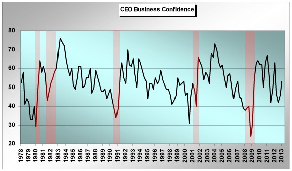
Although no one in this wonderful world is clairvoyant, inclusive of every central banker on planet Earth despite what you may have heard, the CEO’s having contributed to this survey over time have had an absolutely remarkable record of calling turns in the economy. And wildly enough, almost exactly on the money. Very important for us as investors given that the financial markets also anticipate. You can see looking at the chart that CEO business confidence bottomed in each US recessionary period prior to the end of the official recession itself – exactly as equities usually bottom and begin to rally prior to the economic bottom in each recession.

The experience in 2001 was a bit different, but you may remember years later that recession (although still “on the books”) was essentially revised away as there were no two down GDP quarters officially. Secondly the 2008-2009 experience was also a bit different. Although CEO confidence bottomed before 2009 even began, downside anticipation was a bit less than in prior cycles. Personally I attribute this to the fact that a credit cycle implosion dragged the economy down with it, not the other way around as is usually the case in “normal” economic cycles. Nonetheless, CEO confidence bottomed well before equities in that 2008-2009 cycle. Had we “listened” to the CEO’s, we would have known the 2009 equity bottom was a buy.

What’s one lesson here? Moves below 40 on the CEO business confidence survey have in the past signaled a near term official recessionary outcome. There are no exceptions to this over the history of the survey. Secondly, the confidence survey has bottomed in each economic cycle at 35 or below. The key is to wait for a reversal off the bottom before diving into the deep end of the US equity buying pool. The move in the survey back above 40 after a 35 or lower bottom in each cycle has been achieved could be considered a prudent trading tool amongst the greater analytical toolbox of life. Again, 2001 is a bit of an exception probably due to the 9/11 event.

Wonderful. We can put this one in the tool box for the next equity and economic cycle downturn. But what about now and the remainder of the current equity and economic cycle?

It turns out that trying to predict meaningful equity market and real economy contractions using the CEO business confidence data is a bit trickier, but maybe not impossible. Have a look at the following chart I’ve marked up more than a good bit.

ceobizconfidence

Let me explain. It’s not hard to understand that out of the depths of each official US recession, CEO business confidence has rocketed higher into the beginning of each economic expansion. The worst is over. Better days lie ahead. For investors as well as corporate exec’s, it’s a much happier time than what has already played out over the recent past. And in many cases we see CEO confidence run to or near all-time highs for the next economic expansion cycle early on in the cycle. Usually a year or so into the expansion cycle sees the pinnacle of CEO confidence for the entire cycle. From there on out CEOs have remained positive on the economy (above 50), but rhythmically less so as each cycle ages. In fact what is a more than apparent pattern in each economic expansion cycle is a series of “lower highs” for CEO confidence itself, ultimately leading to the next business cycle contraction. I’ve marked these clearly with the descending blue lines in each cycle.

Although we have a whopping three data points/patterns of historical experience when trying to anticipate the downside using this survey, each cycle iteration was extremely similar. As each economic/market cycle was nearing its conclusion, the prescient CEOs became a good bit more gloomy. In each cycle we saw a move to the approximate 42-43 level (the red dotted line), one last spike up in confidence that went no higher than the 50-55 range, and then the final move below 40 that signaled the expansion was over. As investors, we need to realize that these were important topping periods for equities.

Why am I bringing all of this up now? We’ve already had our move to the 42ish range for this cycle. We’ve put in the series of declining highs. In fact the most recent dip to 42 was the second time the survey hit the low 40’s in this cycle (once in 2011 and once in 2012). Are we getting a “double” due to unprecedented QE? We’re cycling back up right now based on the most recent survey numbers (1Q 2013). So, IF historical patterns and their implications for both the real economy and financial markets hold true, we need to watch these numbers like a hawk ahead. If we can break the series of declining highs to the upside, the CEOs will be telling us this already extended cycle extends further. But on the chance we see CEO confidence break back down and potentially arrive at 40 or below, I would personally consider it a very serious warning, unprecedented central banker actions or otherwise.

We’re not there yet and may never be, for all I know. The unfortunate part of the equation is that we will not again see these CEO confidence survey results until July. To be honest I believe the length between cycle results actually heightens their meaning. I told you at the outset this would be a bit of a for what it’s worth discussion. Nothing actionable right here and right now in terms of trying to make a macro call. Rather, I’m just trying to anticipate the relatively consistent rhythm of human behavior as we move into the summer months. I know real fundamentals and earnings trends have “meant less” to investors so far in 2013 relative to what has been the meaningful impact of the weight and movement of global capital. We’ve been here before. And of course the one absolute guarantee of the financial markets? Everything changes. Count on it.

MANUFACTURING SOME PERSPECTIVE

Every once in a while I find it very helpful to just sit back and look at charts that essentially have no titling. At least for myself, it’s often an easy way to “see” trends, or more importantly change in trends, without having my own personal bias of the moment get in the way of trying to interpret what the chart(s) may be telling us. Guess what? Now it’s your turn. Here you go.

charts1and2

Clearly what we are looking at above are not stock charts as we are not looking at price, but rather percentages, or more precisely percentage contributions as I’ll explain in one minute.

First, as you know, in the middle of last week we were treated to the ISM number for April. Weaker than most would have liked to have seen, but not wildly surprising given recent and obvious weakness in the Chicago and Milwaukee manufacturing numbers. The number came in at 50.7%, not too far from the mainstream vision of the “dividing line” at 50, which theoretically represents the demarcation line between economic expansions versus contraction. A reading below the current has only been seen in 4 months out of the total number of months since the current economic recovery began in the summer of 2009 (two of those came recently in November and December of last year). I will not drag you through an extensive historical retrospective, but the fact is that 50 is not the correct “economic demarcation line” number. If one goes back and looks at all the macroeconomic contractions or recessions in the US historically, ISM numbers in the mid-40’s have characterized such periods. We’ve had plenty of brushes with 50 and numbers just below without a subsequent recession over time. So to suggest that a drop to or slightly under 50 is a major recession warning is incorrect…for now.
Although many have given up on US manufacturing having watched the offshoring of so much former US manufacturing in the prior decade, the fact is that manufacturing has taken on relatively heightened importance in the current cycle for a number of reasons. Okay, Chart #1 you were looking at above is US personal consumption of “services” as a percentage of total US GDP. Remember, we export very few “services” as the bulk of services are “consumed” stateside. Very telling that US consumption of services as a percentage of GDP has been falling consistently over the 2009 to present period.

As you’ve probably guessed by now, Chart #2 is US manufacturing as a percentage of GDP. If these two charts were indeed stock charts, which is the potential buy and which is the potential sell in the current cycle? Without question the US manufacturing sector has been an important sector contributor to overall US economic health in the current cycle and it’s really no surprise as to why. Manufacturing in the US has benefitted nicely from the flood of foreign stimulus unleashed over the last five years by Asia, Europe, South America, etc. Since we do not export services, there has been no such foreign sourced benefit to the service sector.

Additionally, the US service sector has had to weather a domestic household deleveraging environment and very sluggish payroll and wage growth environment. Most probably do not realize this, but the year over year change in the US service sector (as measured by the PCE numbers) in the current cycle is the slowest over the Fed sponsored recorded history of US GDP stretching back into the late 1940’s.

pceservices

To keep myself honest more than not, the numbers above are the actual nominal numbers as opposed to the real, or inflation adjusted numbers. But even adjusting for inflation, total US service sector recovery in the current cycle has no comparison with prior cycles. Talk about not being able to achieve “escape velocity”, the US service sector in the current cycle is what that characterization is all about.

gdpservices3Q

So in one sense, the relationships you see do not speak to a dramatic US manufacturing recovery, but more of a default environment where manufacturing has done better than services as services are the anomalistic weak standout relative to historical cycles. Just why is this important? Absent meaningful US payroll and wage expansion, it’s a darn good bet the US service sector will continue to remain in tepid water at best. And that puts a big spotlight on US manufacturing looking into the back half of this year and beyond. It should be very common wisdom right now that the US will experience lackluster economic growth in 2Q and 3Q. The initial fallout from sequestration will be felt front and center during those two quarters. But very importantly, consensus thinking on the Street is that the US economy will pick up steam in the back half of the year and into 2014. Important to investment decision making, we see exactly the same pattern with consensus expected corporate earnings right now. Tepid near term growth, but a huge acceleration into the latter part of the year on into 2014. The hockey stick effect is alive and well, as is pretty much always the case anyway. Although I may not be connecting all the dots, it seems reasonable to assume that the non-services portion of the US economy will be very important to the expectation that earnings are about to rocket higher into the back half or 2013 and into 2014.

If the train of logic here is even half right, then it leaves me with a very large, and for now unanswered question. Why are cyclical stocks having such a tough time relative to defensive and consumer oriented equities? Yes, I know all about the “hunt for yield” thesis. Unfortunately, so many defensive and yield oriented equity sectors exhibit valuation metrics of the moment at multi-decade highs that forward investment risk is meaningful. Thanks, Mr. Bernanke, for forcing those who can least afford to accept investment risk (those dependent on investment income) to pay decades high top valuations to achieve very low nominal yields. If you ask me, it’s a very overcrowded trade and one that may end very badly for retail investors myopically focus on stated yields.

The following chart is a look at the Morgan Stanley cyclical stock index versus the Morgan consumer index. We’re resting at what appears quite the important juncture of the moment, now aren’t we? The actual economic numbers tell us manufacturing is important, implicitly suggesting cyclical stocks are a key watch point.

cyccmr

It is absolutely clear that on a relative basis, cyclical stocks peaked in 2011 relative to their consumer brethren, despite the fact that actual US manufacturing as a percentage of GDP has increased since then while services consumption relative to GDP has declined.

Hopefully without trying to force fit relationships, there are two other assets whose charts look a heck of a lot like the one above from 2010 to present. First, without the titles.

goldecopper

With the prices in the charts, you can guess them. Top chart is gold and the bottom copper.

I suggest to you it will be very important to monitor the health of US manufacturing ahead. A good chunk of forward consensus US corporate earnings expectations depend on it. In a forward discussion I’ll come back and look at US port statistics in an effort to further gauge the vibrancy of global trade, and by implication the health of US manufacturing. If the chart above of the Morgan cyclical versus consumer equities breaks the lows it rests upon, I suggest to you it will meaningfully call into question the hockey stick consensus US corporate earnings expectations for latter 2013 and into 2014. Oh well, I guess it’s a darn good thing the Fed has told us they may print even more money ahead. Stay tuned.

Is It Different This Time?

One of the apparent conundrums of US Fed money printing in the current cycle is lack of headline inflation, at least as measured by the CPI. Certainly the CPI calculation itself is open to debate in terms of whether it is accurately depicting the cost of living in the US. But in bigger picture context, alongside quiescent headline CPI, the US credit markets have likewise not priced in meaningfully accelerating inflationary pressures. Although the very act of currency debasement academically connotes rising inflationary pressures, the US Fed has received a free pass in the current cycle so far as prior period predictions of a hyperinflationary fireball have fallen well short of the mark.

Meaningful to global economic and financial market outcomes ahead will be the Bank of Japan monetary extravaganza of a generation that lies directly in front of us. Will Japan be so lucky as to have little to no headline inflationary impact while printing historic amounts of money? Or could it be different this time relative to the US monetary and inflationary experience of the last four to five years? Although not given much recognition amongst the high fiving over recent Japanese equity market levitation, there is one critical difference between the backdrop against which the Fed has operated compared to the landscape the BOJ faces.

If we step back and take a bit of a bird’s eye view of the current cycle, a keynote fingerprint character point of Fed monetary policy is that it has played out in the direct aftermath of a US credit cycle bust. In terms of the timing and sequencing of potential cycles of inflation, this is important to keep in mind. In one sense what the Fed has sponsored with its own balance sheet growth has simply offset in magnitude balance sheet contraction in other sectors of the US economy, probably none more dramatic than the damage we’ve seen done to the asset backed markets over the last half decade.

assetbacked041213

Key point being, the BOJ ahead will be operating in no such environment of immediate prior period credit contraction. The credit contraction, if you will, in Japan already occurred long ago. So if we think about Japan as a total system, BOJ money printing will be expanding the total balance sheet as there is no offsetting individual sector balance sheet contraction of consequence.

As a bit of a visual proxy, let’s have a look at Japanese bank loans outstanding since the early 1990’s. Bank loan contraction bottomed eight years ago. And as you can see, on a rate of change basis, year over year Japanese bank lending is in positive territory where it has spent precious little time if we look across a number of decades.

japanesebankloans

As of the moment, the US and Japan find themselves in different credit cycle bust aftermath time sequences. And so we should expect similar inflationary outcomes under historic monetary policy experiments? I think not. Of course the second large and differentiating factor so far is relative currency movement. We all know what has happened to the Yen over the last five months. The US dollar never experienced this type of decline anywhere over the current 2009 to present cycle. Bottom line being, we should not be surprised to see a quite different outcome with inflationary pressures in Japan than has been the recent case in the US under similar monetary extremes.

A few final comments. First, nominal inflation would really pick up in Japan if economic acceleration accompanied by meaningful wage gains were realized. This remains an open question mark on both fronts. Political leadership has advocated for higher wages in Japan, but corporate profit margins will be the ultimate determinant. On the economic front we are already seeing fallout from BOJ policy not necessarily favorable. Much as has been the case with US Fed actions for years, investors have already been trying to “front run” the BOJ. With the announcement from the BOJ targeting the lengthening of balance sheet asset maturities, investors bought long maturity JGB paper funded with sales of short maturity paper. This modestly drove down longer maturity rates, but drove shorter term yields up. Lending rates in Japan are keyed off of shorter maturity (two and five year) yield levels, so this is not a plus for lending, and by implication economic expansion. It’s more a prescription for stagflation.

Finally, as investors we need to think about and monitor whether actions of the BOJ could transmit inflationary pressures globally, much as the actions of the US Fed have done, especially in emerging markets. We already know financial asset inflation, especially stock prices, is a key target of BOJ policy. Without question, additional Japanese capital moving out of the Yen will impact global equities. But credit markets are the key watch point as they will price in potential accelerating inflationary pressures long before equities. In the US, it’s the TIPS implied inflation breakeven rates that I continue to monitor. The US Fed began its latest round of monetary largesse at the highest implied breakeven rates of the current cycle. We’re just not that far from breaking out to “new highs” not only for the current cycle, but for the prior decade.

tipsbreakeven041213

For now, the grand monetary experiment continues. We simply need to be careful of the high level of complacency that has grown up around the impact of monetary policy on inflationary pressures in developed economies. The impact of BOJ actions will be global in nature as well as unprecedented. Stay tuned.