Logging In

A few weeks back I penned a discussion regarding a number of noticeable technical divergences we’re seeing the in current market environment.  How these resolve will be important over the short term.  Now that the debt ceiling decision has been forestalled, the markets are basking in the knowledge tapering is clearly off the table for the foreseeable future.  Very expedient political decision making in front of the 2014 mid-term elections, I must say.  How much further will the markets run on the discounting of no tapering, or is this now in price?  In this discussion I want to look at a number of chart patterns whose resolution will perhaps be very important from an intermediate and longer term standpoint.  And it just so happens these patterns are singing in multi-part harmony exactly as the markets are now assured of no tapering any time soon.  Quite the interesting juncture between sentiment and price.

Before looking at the charts, a quick comment.  To the point, below is a look at some very long term charts of the major and most popular equity indices.  Very simple stuff.  But what I’m showing you is a bit of a curve ball.  The top graph in each clip is a log scale view of life for that equity index, while the bottom clip is non-log.  The important issue is that in each case I’m looking at the long term history of rising tops in each index.  As per the logarithmic charts, we’re not quite there yet in terms of hitting these rising tops lines of significance.  But when looking at the same index in non-log terms, we’re either sitting right on top of a very long term resistance/breakout line, or we have already modestly risen above the historical series of rising tops.  The last issue of importance is that these patterns are completely consistent across all of these major indices.  Does that speak to the commoditized character of equities relative to alternative global assets classes of the moment (that are underperforming)?  Regardless, I believe these charts are more than deserving of our monitoring as we move ahead.

Let’s look at the charts as they tell their own stories and I’ll finish with a few comments.

dow1013

As a quick aside, I could not help but notice monthly RSI has so far put in a series of lower highs at each major nominal price top over the last decade plus.  We see this in a number of the indices below along with a few flat line triple top RSI patterns of the moment.  At least for the Dow, this is just about as textbook a broadening top formation as one is likely to see in terms of long term price.  Again, the individual log versus non-log chart proximity to the rising tops line is clear.  You’ll see exactly the same in the charts below.

trans1013

The mid and small cap indices lay below:

mid1013

(So far all the charts above show us the declining tops RSI line, but that’s about to change.)

russell1013

I’ll end with a quick look at the NASDAQ that does not share near exact rising tops price experience since 2000, as we all know.  But a rising tops formation since late 2003 to present is relevant.

comp1013

I’ll keep the closing commentary short as I’m more than sure you get the picture (no pun intended).  We’ve seen a number of strategists and pundits talk about the end of the 2000-present secular bear in equities and the beginning of a new secular bull.  I would suggest that for those even contemplating such an outcome, monitoring the charts above is critical.

Very quickly, I personally believe breakouts to the upside, if they occur, could be signaling something other than a new secular bull mostly because for now we just do not have the type earnings growth normally associated with secular bull awakenings.  Alternatively, breakouts to the upside could be telling us a true bubble in US equities is beginning to form.  I do not mean this to sound pessimistic by any means.  As always, what is is.  Rather, if it is to occur, I personally believe it will be driven by a near historic lack of acceptable alternative investments in a world both awash in liquidity and intentionally starved for rate of return in safe investment vehicles by central bankers.  Remember, at the equity peaks in 2000 and 2007, believe it or not even money funds offered more than acceptable rate of return refuge.  No longer.  A potential US equity bubble would be driven, in my mind, by a growing and near historic sense of “nowhere else to go” with global capital (that is scared of debasement and confiscation).

As simpleminded as this may sound, it’s either very important price breakouts or breakdowns ahead.  And given the relatively commoditized nature of equities as an asset class for now (don’t strikingly similar chart patterns suggest as much?), I would expect either breakout or breakdown outcomes to be consistent across the entire group.  Given my impeccable historical track record of being 100% unable to exactly predict the future (it’s just a good thing I’m in the very good company of other human beings on planet Earth), I’m need to wait and see where price travels from here.  My suggestion to you is to keep the very long term charts on your radar.  This is not a time to let personal ego get in the way of respecting market messages.

Diverging View Points

Personally, I think even attempting to call a top on this character of an equity market is an exercise in the self-infliction of pain for now.  It has been a long time since I’ve seen this type of speculation, but it’s been never since I’ve seen this type of monetary largesse.  Moreover, when was the last time both the Fed and politicians have meaningfully attempted to “shape” societal perceptions, let alone hoped for economic outcomes, via manipulation of the financial markets?  We know capital is “concentrating” right now, and the repository is US and large global equities.  The Fed has been 100% successful in forcing capital into equities and real estate, exactly as their years ago game plan detailed.  Likewise, with the tapering genie now out of the bottle, we are watching a rescission of global capital that originally spread out across planet Earth as QE went to ever greater heights since 2009.  The outgoing tide is now coming in.  These two forces, domestic investment concentration in one asset class and an incoming tide of liquidity from broader global risk assets (think emerging markets, commodities and the metals) characterizes the moment.  And for now, liquidity and the weight and movement of global capital trump strict fundamentals.  Nothing new, we’ve been here before.

But a funny thing happened on the way to new equity highs recently, for the first time in many a moon we’ve begun to see more than a few noticeable technical divergences.  Remember, technical analysis is a suggestion, not a hard and fast mandate.  It suggests to us what might be, as opposed to definitively speaking to what will.  Technical signals, especially in this character of a market, can change meaningfully and fast in both directions.  A lot of tried and true historical “systems” have simply broken down for now.  After all, technical analysis is tough enough in a free market environment, let alone the type of one in which we now find ourselves.  As always, adaptability is essential for survival.

I promise, the last thing I’m trying to do in this discussion is call a top.  This is merely an attempt to provide perspective.  I’ve seen many a market that was a “no lose” environment…until the losses started.  I’ve seen markets where complacency reigned for an extended period…until it didn’t.  You know the routine.  So rather than pontificate about where equities are headed next, primarily because I have no idea (and neither does anyone else), I thought I’d simply let a number of charts do the talking.  Again, perspective, not predictions.

One very apparent divergence we’re seeing right now is the NYSE advance/decline line relative to the S&P itself.  The cumulative AD line has been in a range since mid-May, while equities have journeyed to recent new high territory.

nyad

Believe me, I’m fully aware of the fact that the NYSE is polluted with a ton of fixed income proxies or surrogates.  Makes a lot of sense that the cumulative AD line has been in a trading range since mid-May as this was when the rumblings regarding tapering began, certainly impacting fixed income and surrogates.

But I think it’s also important to remember that in the period leading up to the 2007 equity market peak, it was credit that was first in trouble, then came equities peaking followed by commodities.  Interestingly before the final equity market peak in 2007 (a lower high on the cumulative AD line), the cumulative NYE AD line when into a good bit of a trading range between mid-May and late July, diverging from equities themselves.  Again, just perspective.

nyad07

Next up is a quick look at the Summation index.  Briefly, the Summation index is really a running total of the McClellen Oscillator (measuring net advances).  Simply, it’s another perspective on breadth.  At least over the past year or so, whenever the Summation Index has dipped below the 600 mark, we’ve either been in or about to start at least a 5% equity correction.  Not this time…so far.  This is the longest period of time we’ve stayed below that demarcation line over the past year and yet still not even a minimal 5% correction.

nysi

Just for fun, what was the setup in ’07?

nysi07

Continuing tangentially with this theme of breadth, let’s have a look at the S&P bullish percentage index.  English translation?  The percentage of stocks in the S&P on point and figure buy signals.  For now, it’s a clear declining tops formation again dating back to that fabled month of May when Fed minions started yacking about tapering.

BPSPX

The 2007 version of BPSPX life?

BPSPX07

Not an exact match by any means, but one has to admit it’s rhythmically similar to what we see today.  All of the three sets of charts above deal primarily with breadth.  They deal with participation.  The Summation Index and the Bullish Percentage indicator are telling us that individual equity participation at each new recent high in the S&P since May has diminished in sequential fashion.  Participation has narrowed.  Often a classic precursor fingerprint preceding meaningful market peaks, but unfortunately in the elusive ways of the markets there is zero indication of timing when or where that peak may occur, if ever.  How’s that for definitive?

Three more quick charts that also deal with the issue of level of participation among equity index constituents.  Pretty simple stuff, below is a look at the percentage of S&P stocks above their 50 day and 200 day moving averages in the following two charts.

50DAY

I’ll spare dragging you through the 2007 comparatives where we likewise saw similar divergences.

200DAY

As one might expect, the message of the two charts is consistent – lower levels of total participation at each iteration equity peak since May.

One last look at broad market participation from yet another lens of the level of equities achieving new highs.  Below you will see a massive spike in NYSE weekly new highs early this year.  Not unexpectedly, it occurred alongside the breakout of the S&P to new all-time highs.  Yet since that time as the nominal S&P has floated higher, the number of new weekly highs has plunged to levels last seen when the S&P was near 1400.  I’ve marked in the chart a number of other periods over the last ten years where we’ve likewise experienced a quick drop in the number new weekly highs.  These were associated with 5-10% corrections (admittedly it was a good bit worse moving into early 2008.  This time around, no 5-10% correction, at least not yet.

NYHGH

Enough.  So there you have it, a number of diverging market points of view that have developed in multi-part harmony over the last six months.  Rather than making guesses about what is to happen to equities ahead, I think the key message here for asset managers is one of respect.  Until these divergences are cleared up, if you will, we need to respect the dictate of risk management.  Every technical divergence is not a message to run for the hills.  But when a multiplicity of divergences appear, it’s a loud message to heighten risk management strategies until there is clear resolution of these divergence in one direction or another.

The Taper Chase

In June of this year Fed Chairman Bernanke first publicly discussed the possibility that the Fed would begin “tapering” their Quantitative Easing program somewhere in the near future. Since that time, conflicting commentary from Fed members and hangers on have kept investors guessing as to actual policy outcomes. In addition, Fed commentary alone had caused real global capital to recede from QE beneficiary risk assets such as emerging market equities, bonds and currencies as well as precious metals, commodities and developed economy fixed income vehicles. Although the Fed assured markets their potential QE tapering actions would be incremental, investors have a funny way of discounting tomorrow today.

We know now that when mighty “Casey” Bernanke stepped up to the plate on that fated Wednesday that was September 18, he adjusted his stance, surveyed the playing field and he took a mighty swing…and a miss. No QE tapering on this fine day. Since his original June speech, the capital markets had priced in a September tapering. It had become consensus thinking among investment strategists. The San Francisco Fed had even produced a white paper just weeks before the September Fed decision supporting the view that QE has been largely ineffective in stimulating actual GDP growth. To their credit, the Fed had successfully shaped market perceptions and behavior to expect the beginning of the wind down of what has been an extraordinary, very controversial and historically unprecedented period of US monetary policy. It was the perfect time to deliver the first tapering pitch. Yet at the last minute the Fed decided to throw the markets and investors a monetary curve ball. So much for Fed transparency, clarity and consistent forward guidance for now.

Just what has the Fed really accomplished by postponement? Why might they have taken a pass on tapering their money printing and bond buying now?

I personally believe tapering postponement buys the Fed very little. But from the start, the Fed has told us they were “data dependent” in terms of the tapering decision. In truth, from the standpoint of data alone, postponement actually makes some sense. Payroll employment growth has not exactly been gangbusters as of late and neither has headline GDP growth – both perceptual Fed targets for improvement at the outset of QE3.

Yet we know that the unspoken truth on the Street is certainly that the unemployment number has been skewed in the current cycle by the labor force participation rate, bringing into question the targeting of the unemployment rate in the first place. The chart below is quick look at the history of what is termed the labor force participation rate. What it tells us is the percentage of the population in the total US labor force – those actually working and those looking for work. The clear anomaly for some time now has been the dramatic fall in this number.

laborforceparticipation

Importantly, we need to remember that when folks no longer receive unemployment benefits, they are no longer counted in the official labor force numbers. The labor force count at any time is the denominator in the employment rate relationship that measures those with a job as a percentage of the total labor force. All else being equal, when folks fall off the unemployment benefit rolls, the labor force count falls, the employment rate ratio rises and the unemployment rate falls – none of this having anything to do with actual jobs being created, but rather a lot to do with those losing longer term unemployment benefits.

Just why is the labor force participation rate falling? At least in meaningful part, structural unemployment. We see this directly in the low skilled labor pool. A number of jobs simply disappeared in the last recession for those with low skills. Those working part time due to inability to find a full time job is near new highs for the current cycle. The number of weeks out of work for those who find themselves unemployed is today higher than any recession peak of the last three decades. Point being, it is more than widely known that the unemployment rate itself is a very controversial number in terms of accurately characterizing US labor market slack, yet it is supposedly a headline Fed QE decision making barometer. In one sense, the Fed is shadowboxing an illusion. Question being, how will the continuance of full on QE 3 for a number of additional months change the reality of the current US labor market?

For now, much the same can be said for the macro economy itself. I won’t dwell on this as the numbers are more than well known. The current cycle has consistently shown us the slowest quarterly GDP growth on record for a continuous economic expansion cycle. Not once have we yet been able to achieve 4% annualized real growth in any one quarter – a record over the history of US GDP data

realgdp

Since the Fed started QE3, growth rates in both payrolls and headline GDP have slowed. Rationale for a postponement of QE tapering? Sure. But again, what will additional QE spark in hoped for acceleration in labor markets and the general economy that the first $3 trillion in QE over the past five years has not already? Exactly what does the Fed accomplish by postponement?

Switching gears a bit, if we believe the ability of QE to meaningfully impact payrolls and GDP over the short term is relatively small, exactly why may the Fed have passed on tapering QE in September?

I personally have two answers hopefully closer to the heart of the moment – interest rates and the debt ceiling political melodrama in which we now find ourselves. It’s a good bet Bernanke and the Fed got a bit more than they bargained for with May rumblings of tapering and the actual mid-June Bernanke tapering dialogue in terms of interest rate movement recently. The ten year US Treasury yield lofted from 1.6% to just over 3% during the May to August period. Importantly, the 10 year Treasury yield is the reference rate against which most 30 year conventional mortgages are based. Conventional 30 year mortgage rates rose to 4.75% in late August from 3.5% or lower in May. This was certainly something the Fed did not want to see as housing has been one of the economic bright spots as of late.

It is interesting to note that the FOMC commentary with the no taper decision began by citing “tightening financial conditions”. At the time, the stock market was near an all-time high, certainly not a “tight” financial condition. In recent quarters we had seen the Fed sponsored Senior Bank Lending Survey show us the easiest of lending conditions for banks over the current cycle to date – certainly not tight. Undoubtedly, the Fed was referring to what had occurred with the general level of interest rates since their tapering commentary began. The taper trial balloon the Fed had allowed to ascend skyward caused a real world reaction in interest rates certainly not to their liking.

Again, what does forestalling QE tapering now mean to forward interest rates? Will bond investors be more accepting of tapering in the future, without sparking such a violent reaction in rates to the upside? The fact is that QE 1,2, Operation Twist, and QE 3 have been in operation over 91% of the time since late 2008. What began as an emergency operation 5 years ago has now morphed into a program of ongoing subsidization. We know the Fed has been the dominant buyer in Treasury and mortgage backed markets for some time. Key question being, will natural bond buyers return to the fixed income markets when a return to free market pricing has been further delayed by Fed inaction? Natural buyers will not return until they can be assured of non-interventionist pricing. We’re still a long way away from such a market environment.

Finally, it’s also a darn good bet the Fed chose to stand down in September due to the debt ceiling political theatrics we have again been treated to in recent weeks. Bernanke directly mentioned that “Federal fiscal policy continues to be an important restraint on growth” in his comments. Tax rates are going higher amidst a slow growth economy. Moreover, components of the Government sequestration process agreed to in early 2013 become effective in early 2014 – there are more Government cutbacks to come that will add up to just shy of 1% of GDP. Of course the irony is that the current debt ceiling debate does not address any of the very important longer term fiscal issues that face the US such as Medicare funding and other booming social costs that lay ahead – these issues are not even on the table.

As investors we simply need to realize that lack of clarity from the Fed may be with us over the remainder of the year and into next. Conflicting Fed commentary has only continued post the no tapering decision. It is generally believed that Bernanke will retire from the Fed in January of next year, but that means that we’ll need to see the President nominate a new chairperson, they will have to be vetted and the Senate will need to approve the nomination all in the next ten weeks (prior to holiday recess). We also have another FOMC policy meeting in December. (I’m assuming the October meeting will produce zero change in policy.) Short term market volatility around these events would be more than understandable.

Yet longer term the question of a wind down and ultimate termination of QE is not going to simply fade away. What began as a needed emergency shot of adrenaline to the heart of the economic patient in late 2008 has now become a continuous IV drip the academicians at the Fed for now deem unacceptable to moderate, let alone remove. QE has been a “subsidy” to both the economy and financial markets. Do Fed policy makers really expect a quiescent market reaction to the potential removal of THE key subsidy of the current economic and financial market cycle? Of course the answer to that question lies somewhere in our now data dependent future.

If You Plant Ice, You’re Gonna Harvest Wind

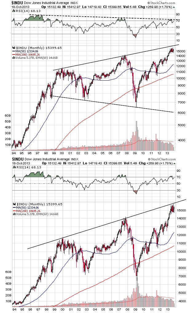
As you know, we all await the Fed word from on high this Wednesday. Will they or won’t they? As always, the most important part of the equation will be the market reaction to whatever happens. Personally, regardless of nominal dollar tapering or otherwise, I expect the Fed to be quite the dovish bunch in terms of commentary. Can they light the markets up regardless of outcome? Look, when a possible Fed Chairman contender who bows out of the race even prior to being officially part of the game can light up financial assets, anything can happen.

Again, although I personally expect cooing and soothing “forward guidance” from the Fed, it’s a very good bet the end game for QE has begun. Why? Just have a look at the following table.

economic data

Of course September of 2012 is when QE3 began. And this is mission accomplished in terms of an accelerating economy? Purely academically, do these numbers support tapering? In so many data points above, decelerating growth to flat at best growth is the character we see. If the Fed’s true intent was to create escape velocity in the US economy, the last thing they would do right now is taper. They know QE is not meaningfully impacting economic acceleration. Don’t get me wrong, it’s helping to maintain growth, but acceleration anywhere even close to historical precedent has remained elusive for the entirety of the current cycle. In fact the acceleration we have seen in GDP in the last few quarters is virtually solely due to inventories. I won’t go into the multiplicity of reasons why Fed tapering will occur as we could spend all day on the subject. From no wealth effect realization to meaningful financial market distortions to less Treasury issuance ahead, the Fed knows the costs and the risks (financial bubbles) of further QE are outweighing the less than hoped for positives.

Throughout the third quarter of this year, investors have become increasingly nervous regarding forward Federal Reserve monetary policy, and for good reason. From the time QE (Quantitative Easing) 1 first started in November of 2008, the Fed has been implementing QE 1, QE 2, Operation Twist and QE 3 in 53 out of 58 months over this period – 91.4% of the time. To suggest that investors in the fixed income markets had gotten used to, relied upon, levered up, and positioned exactly for Fed stimulus to continue is an understatement. Yet we need to remember that Fed monetary policy has influenced global financial markets far beyond simply US borders. Yes, we know Fed decisions will influence US financial markets, but what about the global economy and financial markets in what is an increasingly interdependent world?

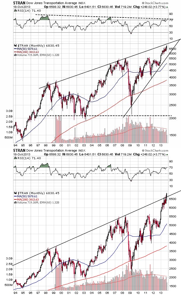
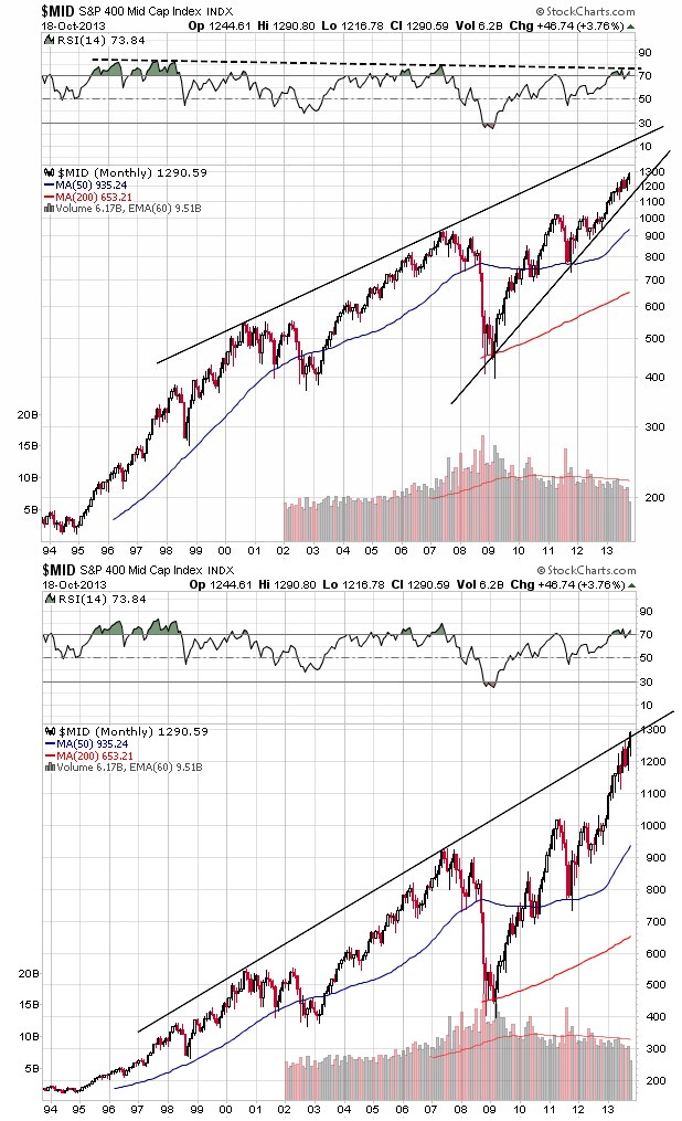
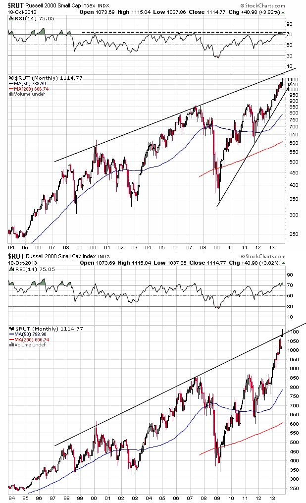
In one sense, the Fed created an ice age for US interest rates by lowering the Fed Funds rate essentially to zero and by printing money to buy US Treasury and mortgage backed securities, putting further downward pressure on longer term interest rates. By design, the Fed wished to push investors into higher risk assets such as equities and real estate by lowering the return on safe bond investments. In the US, the Fed accomplished this goal as equities levitated despite lackluster economic and corporate earnings growth. Likewise, investors have turned to real estate investments in the hunt for rate of return that had vanished from the world of bonds.

But as the Fed printed ever more money to buy bonds, they created increasing amounts of liquidity that ultimately spilled over into global financial markets beyond US equities and real estate. In recent months emerging market equities and currencies have been under more than noticeable pressure. I’m referring to Brazil, India, Indonesia, Thailand, South Africa, Turkey, as well as a host of others. In addition, emerging market currencies and bond markets have likewise not been kind to investors. Although US equities have shown us double digit gains this year, an investor in an asset like the Vanguard Emerging Markets fund has lost 14% of their money on a price basis through August. In fact over the last six months, not one of the equity markets in the MSCI Emerging Markets Index beat the MSCI World Index. The last time this happened? Almost 13 years ago. Quite the juxtaposition in global equity performance, but understandable when one considers the prior period global spillover of Fed QE into the global asset markets all in the search for higher rates of return in a period that had become an ice age for nominal US interest rates.

Now that Fed “tapering” of QE is a process the markets are starting to price in and the fact that this tapering will continue at some pace until QE is ultimately terminated, glacial or otherwise, again it’s not just US assets that will be affected in the rhythmic dance. As Fed liquidity expansion found its way into global equities, bonds and currencies, so now is the anticipated reduction in future liquidity causing capital to leave these very same assets (knowing full well ever increasing liquidity will not be there to support them). We’ve seen this before in terms of the movement of global capital, nothing new here. The Fed planting of ice in US bond markets is now resulting in a harvest of wind among global asset classes all based on the anticipated reduction in liquidity to come. Humorously, countries complaining about too much QE even six short months ago are now complaining about its eventual end. For now, we are currently seeing the anticipated liquidity reduction harvest of wind in what are academically considered the riskiest of assets – emerging market equities and bonds, currencies, and commodities – as equities of developed countries such as the US, Japan and some European nations have continued to hold up. Important message being, the Fed’s QE is not limited in influence to US markets. Nothing happens in isolation. The Fed has in good part again set global capital in motion.

Back in the 1980’s as Volker was practicing restrictive monetary policy, the emerging markets accounted for roughly 15% of total global GDP. A decade later that had grown to somewhere near a third and now we’re looking at something closer to one-half. We also need to remember that in the central bank driven monetary expansion from 2009 to present, it has been estimated that close to $4 trillion in liquidity flowed into emerging markets in the hunt for higher returns. The capital flows into emerging nations were a tremendous gift that a number of these nations simply chose to squander, mostly in deference to political expediency. With the advent of Fed tapering and a reversal in global capital flows to the emerging nations, the countries that failed to reform are now paying the price, as are investors in these countries. Brazil, Indonesia, Turkey, India and South Africa are the poster children of the moment for having lived beyond their means (large current account deficits).

So here’s the dilemma. If we think back to prior historical periods of capital outflows from emerging and developing economies, precedent was set that US interest intervened to stabilize currencies, and ultimately economies. Trust me, US interests were protecting US interests (prior period US institutional investors in these countries and their currencies). Remember Mexico? Remember the Asian currency crisis of the last 1990’s? For now, the Fed has made it relatively clear that current capital flow problems in emerging nations are neither the Fed’s problem nor focus. That may be fine for the Fed, but what about us as investors? Unlike the Fed, this is our problem. You’ve probably many times heard QE characterized as the “papering over of problems”. Well, for many an emerging market this was exactly true. QE allowed a number of emerging countries to go on believing their imbalances were sustainable! It allowed them to practice discipline avoidance.

Fast forward to the present and the academic solution based on historical experience proffered for these now struggling economies is higher domestic interest rates. A tough one at present when declining currencies cause higher domestic inflationary pressures, to say nothing of having to deal with currency and financial market weakness amidst weakening internal economies. Do these economies choose to rebalance and reform against the backdrop of a slowdown in global liquidity creation? Sounds like a prescription for internal political suicide to me. The reason I’m bringing this up is that I feel it’s very important that we now monitor whether the financial markets will force this reform and rebalancing in a number of emerging economies/financial markets. It just was not that long ago we saw virtually an identical replay in Greece, Italy, Portugal and Spain – and that was with historic QE expansion yet to come! The financial markets forced their own version of rebalancing on the Euro periphery countries. Will it now selectively pick off a number of emerging economies?

One watch point is the OECD composite leading indicator numbers. As of the latest data, the developed economies are showing relative strength, but the emerging market economies are showing us the weakest readings. My personal feeling is the Fed will turn a blind eye unless emerging economy issues directly hit the deck of the US economy. The emerging market current account deficit offenders of the moment – Indonesia, India, South Africa, Brazil and Turkey – only account for 6% of total US exports. The Fed is not going to blink unless say a China is negatively impacted in a loop that circles back to the US economy itself. Although the future trajectory of US interest rates and financial assets generally is certainly an important issue for investors, now is the time to keep an eye on the emerging markets. The fact is that no one knows what will happen ahead. The reversal of the greatest central bank monetary experiment on record has no roadmap.

There is one last issue concerning QE and the general comments above deserving of our attention beyond what we are seeing strictly in US markets. The Fed’s QE created dollars that found their way into global financial markets. Plenty of dollars were invested abroad in search of higher returns, but so too were dollars borrowed globally. The Indian corporate sector has $100 billion in unhedged dollar denominated debt outstanding. With the anticipated reduction in QE causing currencies like the Indian rupee to fall meaningfully as of late, the dollar denominated debt of Indian companies expands due solely to increasing currency differentials. This set of circumstances, especially among emerging market nations with large dollar denominated debt, has the potential to create a spike in the US dollar. The Fed tapering QE means dollar liquidity globally will no longer be expanding at the rate it has since 2009. Less growth in dollar liquidity ahead may cause a scramble among foreign entities with dollar denominated debt to obtain dollars in the short term to pay it back. Although we are not there yet, a spike in the dollar would negatively pressure US multi-national corporate earnings longer term. But a spike in the dollar would bring ever more global capital to the US and the US dollar near term. I know this sounds crazy, but could the tapering of QE cause a real bubbling in dollar denominated assets such as US equities? Much more so than we have already seen not based on investment fundamentals, but strictly on the weight and magnitude of global capital searching out relative safety and return? We know global asset classes showing us positive returns in 2013 have narrowed considerably. Global capital has already started to concentrate. Could Fed decision making further and heighten that concentration? Again, anything can happen in a world where global capital has been set in motion.

Although the media has focused almost exclusively on the US bond market and US financial markets broadly amidst the current round of Fed decision making, we need to remember as investors that we live in a globally interconnected world – both real economies and capital markets. For well diversified and globally oriented portfolios, the influence of Fed decision making on US assets is only one component of total analysis. Nothing happens in isolation.

Counting Cards

There has been many an article written about the similarities between gambling (largely poker) and investing. The important macro self-disciplines for each are common denominators – the importance of risk management, decision making under uncertainty, position (bet) sizing, and the list goes on and on. Of course we have investment world notables such as David Einhorn living a bit of the dual life as an example of this linkage.

Whenever I walk into a casino, the same thought always initially pops into my mind. Don’t these folks realize the statistical odds they are facing in the various games being played? Don’t they understand the odds are heavily stacked in favor of the house and against them, especially if longevity of play is involved? The correct answer is, “of course not”, or casinos would be deserted. Certainly for most, it’s not about the odds, but rather entertainment. There is a price for entertainment and at least in a casino the patron ultimately sets the price! The price being the amount of cash they are willing to part with.

In like manner, we do know there are a number of folks more than well aware of the odds presented by the casino gambling experience. Folks such as former mathematics professor turned hedge fund manager, Ed Thorp, successfully beat the supposed gambling establishment at its own game by developing a system for counting cards in blackjack. Counting cards enabled Thorp to gain a statistical edge and changed the house-assumed odds of the game in his favor. And yes, it also bought him banishment for life from physical casino facilities. There is zero room for a level statistical playing field in the gaming industry.

So why talk about statistical odds and counting cards? We know that the Fed is set to taper their bond purchases dead ahead. I personally believe that once they start, there will be no re-firing up the printing presses regardless of economic outcomes. Reactionary financial market outcomes may be another story, but even then I believe the Fed wants out, period. So now it’s all a matter of pacing and magnitude of position reduction until the Fed polishes off its final free drink and leaves the gaming table for an extended period.

What I hope is meaningful is a bit of card counting in terms of the Treasury market, which is extremely important given what we’ve already seen in the movement of US Treasury yields post May. For now, I’ve seen many a suggestion that the Fed will first start the tapering with a reduction in Treasury purchases while they leave the magnitude of MBS purchases intact. We’ll just have to see come September 19. I’ve also seen many a pundit characterize the recent Treasury market selloff as one of the worst in history. Unfortunately, what I do not see is a discussion of context. Historical Treasury market corrections were never preceded by the type of monetary intervention we have been treated to in the current cycle. So history may be quite the imperfect guide and comparator.

Can a look at the complexion and character of US Treasury owners over the last quarter century help us in counting the cards of the current cycle? Who, or whom, have been the key provocateurs of price support? How has the ownership structure of Treasuries changed over time? Assuming the Fed will be done purchasing Treasuries by perhaps mid-2014, just who will pick up the slack? How many current and large Treasury owners have already played the bulk of their “face cards”, with perhaps little left to play further? Perhaps counting the cards of the moment can help us anticipate the odds of a number of potential future outcomes in the Treasury market.

So let’s start with an historical retrospective of Treasury ownership itself. The following table is populated with data derived from the Fed Flow of Funds report. We’re looking at the major holders of Treasury securities across time and how their ownership percentages have changed. Quite the story.

percent ownership treasuries

I’ll keep the comments brief as none of this should be “new news”. As we look back over the last few decades, it is clear that the foreign sector and the mutual fund complex have played the bulk of the face cards in their hands. You can see that these numbers are as of 1Q 2013 period end, prior to the beginning of turbulence in US Treasury prices. We also know that since that time we’ve seen record outflows in the US mutual bond fund complex. Is it reasonable to speculate that perhaps mutual fund holdings of Treasuries as a percentage of the total outstanding has peaked at a high unseen for at least a quarter century? Very reasonable.  Although no one knows what lies ahead, it’s hard to see Treasury mutual fund flows accelerating any time soon after the price jolt we’ve seen in recent months. The US public just does not have a history of “chasing” deflating assets, quite the opposite.

Interestingly, pension fund ownership of Treasuries as a percentage of the whole has been remarkably stable over time, dipping in the recent period as yields hit generational lows. The mantra has been that pension funds starved for guaranteed rate of return would be a natural buyer. Given assumed actuarial return assumptions of the moment, that could be true, but certainly not at current nominal Treasury yield levels that don’t even come close to these assumed return levels. It’s going to take higher interest rates to bring pension capital to the Treasury market.

Banks and Insurance companies appear to have been very rational in their portfolio management of Treasury holdings over time, cutting back as yield levels fell over multi-decade periods. With mark-to-market capital rules in the banking industry, are these folks really going to attempt to catch the proverbial falling knife and risk possible perceptual hits to the capital account? Same deal with insurance companies. They are not in the business of making it on the policy premium side of the P&L and losing it investing. Moreover, even in a much higher rate environment in 2000, banks and insurance company holdings of Treasuries were one-fifth of the magnitude of the foreign sector. At least over the last decade plus, they never held enough face cards to meaningfully influence the game.

Perceptually, households have decreased their direct ownership of Treasuries as yield levels have fallen over the decades. But we also know that household ownership of bond mutual funds grew significantly from 2009 to early this year. As mentioned, these flows have reversed in relatively violent fashion in recent months for very obvious reasons.

The thought that the Fed owns all the Treasuries right now is absurd. What is not absurd is that the Fed has been the largest single buyer of Treasuries in recent years. The whole flow versus stock argument. For now, at the margin the Fed is the most important player at the table, but they are set to lower their position sizing and ultimately leave the table entirely. What does that suggest about the size of future winning pots when a whale leaves the game?

I’ve saved the foreign sector for last for very obvious reasons. Talk about the 800 pound gorilla in the room. I personally believe there are two sides to the story here. First, we know the accumulation of Treasury securities by the foreign sector has been largely attributable to China and Japan over the last few decades. The driver was simply mercantilist economics – the financing of the Asian export juggernaut. We also know that export machine is slowing. Over the first six months of 2013, Chinese ownership of Treasuries increased $55 billion while Japanese ownership decreased by $28 billion, almost a wash. The Fed has bought more Treasuries on a net basis in one month than these two have bought in six. Given the internal issues faced by both China and Japan, have they simply run out of face cards to play at the Treasury table?

Alternatively, and we have not yet seen this, we need to be aware of the potential for global capital flows to at least help support Treasuries, but not for economic reasons (such as the mercantilist economics theme). The big question for not just Treasuries, but really the US financial markets broadly, is whether global capital will move increasingly to the US dollar out of fear. Fear of currency debasement (just look at the emerging market currencies), fear of capital confiscation (just look at the bail-in mechanism in Europe), etc. IF global capital concentrates in the US dollar, we may see increasing flows to US equities, real estate and fixed income vehicles that may help forestall higher Treasury yields for a time. Again, we’re not there yet.

Are we facing some type of Treasury market implosion ahead? Of course not. There will be a buyer, that’s not a major issue. The key issue is price. Price will adjust to accommodate supply and demand dynamics. As we try to count the cards revealing the character and complexion of current Treasury holders, I think it’s very fair to suggest the major holders of the moment have played the bulk of the face cards in their hands. We’re seeing a reversal in bond fund complex ownership (16%). We know foreign sector accumulation of Treasuries is slowing meaningfully on a rate of change basis (48%). And we know the Fed needs to end the QE experiment as results have not been forthcoming (15%). Collectively we are looking at behavioral change among the cast of characters that owns just shy of 80% of currently outstanding marketable Treasuries.

As in blackjack, when the bulk of the face cards have been played, the odds of “winning” with successive hands decreases. Ed Thorp would suggest we reduce position (bet) sizing. Of course one way to bring more players and new capital to the table is to increase the payout rate. In the case of the Treasury analogy, that’s yield. This is where we have been for the last three plus months. Is this where we continue to head looking forward based simply on counting cards?